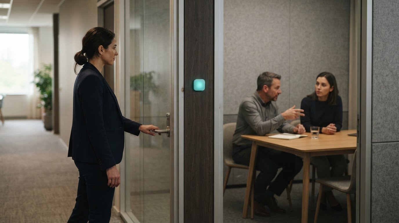

The quietest interface isn’t the one with the fewest alerts. Calm technology for the office works by making useful information available without repeatedly pulling people away from their work. Attention should move to the foreground only when a person needs to act.
That principle matters because a notification can be useful and still cause friction when it interrupts at the wrong moment. A calmer workplace does not hide important information. It helps people sense what is happening, then makes the signal more noticeable when the situation calls for it.
This article explains how to design interfaces that reduce mental effort, keep information in the periphery through ambient cues, and match alerts to their urgency. It also explores how to apply these ideas to everyday office technology, with attention to user control, context, and what happens when systems fail.
Key Takeaways
- Design alerts to match their urgency, and reserve disruptive popups for situations that truly need immediate attention.
- Let routine information stay in the periphery, where people can notice it without leaving their primary task.
- Use subtle environmental signals to communicate changes without adding another stream of screen notifications.
- Test interface choices in real office contexts, then refine them around actual user behavior.
- Keep people in control of automated actions and make the system’s behavior understandable when it cannot operate quietly.
How can I design a calm interface?
There is no single cost for calm office technology. It depends on whether a design uses existing interfaces, physical indicators, or both, as well as on integration and customization. A calm interface might be as simple as a visible status cue or involve several connected elements.
Principles for Workplace Interfaces
Calm technology for the office gives people useful information without making every update demand attention. This matters when technology should support focused work, not add unnecessary interaction. A practical test is whether a feature helps someone understand a situation with less mental effort. For example, a shared availability indicator can show a room’s status without requiring employees to open a dashboard.
Physical Interfaces and Clear Status Signals
Physical signals work best when they fit the way people already notice changes around them. An office window indicator can show whether someone is busy without interrupting them. A kettle can signal that it is ready, then remain quiet. These examples make status visible through the environment rather than another notification. Choose a cue people can understand without stopping their task.
Notifications and Interruptions
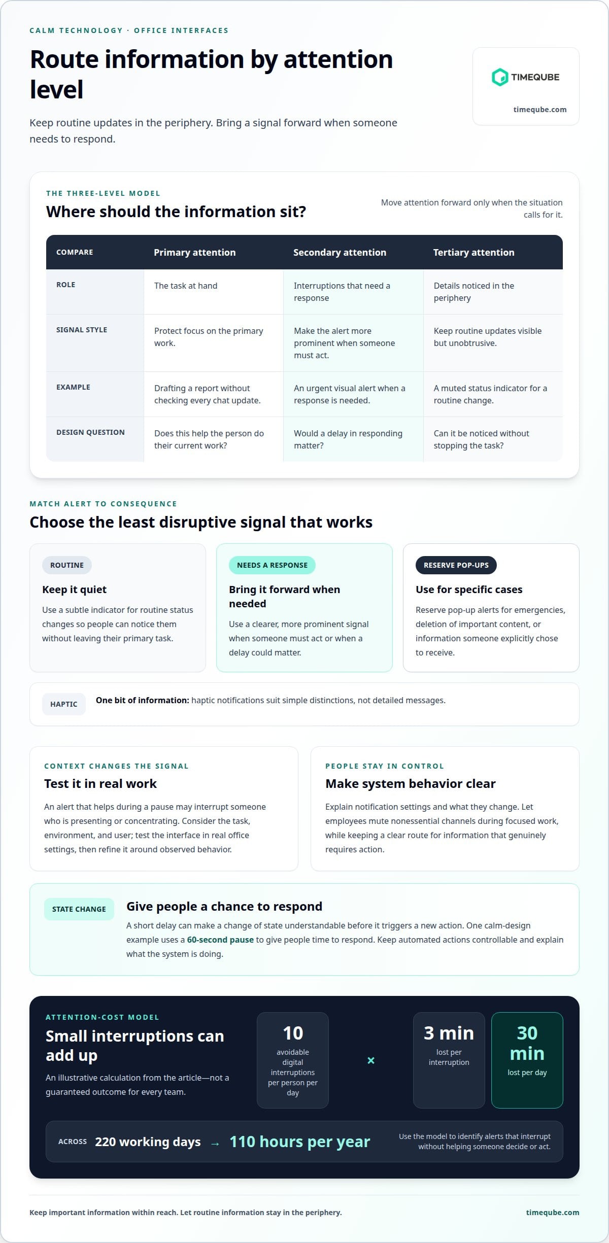
Reserve pop-up alerts for emergencies, deletion of important content, or information someone has explicitly chosen to receive. Routine status changes can stay in a quieter channel, such as a subtle indicator. Haptic notifications typically convey one bit of information, so they suit simple distinctions rather than detailed messages. Match each signal’s urgency to the consequence of missing it.
Users, Context, and Edge Cases
Context-aware design responds to the task, environment, and user rather than treating every moment alike. An alert that helps during a pause may interrupt someone who is presenting or concentrating. Consider an office window indicator: its meaning should stay clear during both busy and quiet periods. Test the interface in real work settings, then refine it based on observed behavior.
Changes, Control, and Failure
Make changes of state understandable before they trigger new actions. A short delay, such as the 60-second pause used in a calm-design example, can give people time to respond. Keep automated actions controllable, and explain what the system is doing. Design for failure, too: if a connection drops or a primary alert fails, communicate the limitation without creating another problem. This is what makes calm technology for the office dependable in everyday use.
Shifting information between the periphery and center of attention
Calm interfaces keep routine information in the background and bring important changes forward when action is needed. Accessibility calls for clear, perceivable signals and alternatives. Employee-facing systems should explain their purpose and give people meaningful control over optional notifications.
Reducing Distractions and Attention Demands
Reducing demands on attention means making information available without asking people to stop their primary task. That matters in an office, where work comes first and communication is secondary. A muted status indicator can share a routine update, while an urgent visual alert can come into focus when someone must respond. The signal should inform, not compete with the work already underway.
A three-level model helps teams organize information: primary attention covers the task at hand, secondary attention covers interruptions that need a response, and tertiary attention covers details noticed in the periphery. For example, someone drafting a report should not need to check a chat window for every status change. Keep low-priority updates visible but unobtrusive. Make the interface more prominent only when a delay could matter.
User Agency Over Attention
User agency means people can decide how and when optional information reaches them. A system that controls attention can create mental and emotional strain, even when each alert seems minor. Offer simple notification controls, explain what each setting changes, and let employees mute nonessential channels during focused work. Keep a clear route for information that genuinely requires action.
Consent and privacy also shape calm design. According to the European Union, the GDPR requires purpose limitation, data minimisation, and transparency; biometric and health data receive special protection. For systems subject to the GDPR, explain why data is collected and limit collection to that purpose. Do not treat a wearable or presence signal as harmless simply because it is subtle.
Estimating the Cost of Lost Attention
An attention-cost model can make repeated interruptions easier to assess. Ten avoidable digital interruptions per person per day, at three minutes lost per interruption, amount to 30 minutes per day. Over 220 working days, that becomes 110 hours per year.
These figures describe a model, not a guaranteed outcome for every team. Use the calculation to identify alerts that interrupt work without helping someone decide or act. Then consider whether each notification can move to the periphery, arrive in a quieter form, or wait for a natural pause. A calmer system preserves attention while keeping important information within reach.
Steps for implementing calmer digital workplaces
Calm technology can reduce interruptions and make routine information easier to manage. The trade-off is that a quiet signal may be overlooked, so important events still need a clear route to attention. Implementing calm technology for the office means changing how information reaches people, not simply switching off every alert.
Use a measured cycle: identify friction, adjust one workflow, then observe the result. Starting with a specific process, such as team chat during focused work, helps distinguish useful alerts from noise. Preserve access to information while reducing demands that do not help employees decide or act.
- Map the sources of overload. Start with one device or workflow. List which alerts prompt useful action, which can wait, and which repeat without changing anyone’s next step. For example, a routine message about a completed task may not need to interrupt everyone on a project. Ask the employees receiving those alerts where they create friction. Their roles and responsibilities can reveal why one signal helps one person but distracts another.
- Set a quiet default. Group routine updates into a digest or make them available in a status area. Keep immediate alerts for events where a delay changes what someone must do. A document comment, for instance, can wait in an activity panel, while an access failure needs a clearer notice because work cannot proceed. Calm technology for the office should preserve awareness without demanding a response to every update.
- Adjust alerts to their frequency. Make a signal calmer as the same event occurs more often. A device reporting repeated routine status changes might shift from prominent alerts to a subdued indicator. Keep its meaning consistent so employees can recognize it without relearning the interface. Provide simple on/off controls and explain which alerts each setting affects.
- Test in real working conditions. Introduce the change where the task takes place, such as during a meeting or focused work period. Observe whether people notice the signal, understand it, and take the intended action. Then refine the design based on actual behavior. A quiet prototype may still distract in a shared workspace with competing visual cues.
- Plan for failure and recovery. Decide what people see when a network connection drops or an alert does not appear. Preserve basic offline functions where possible, and explain when information may be delayed. Keep automated actions understandable and controllable. If a system cannot operate quietly, explain what changed and what employees can do next, rather than multiplying alerts or leaving them uncertain.
Review the workflow when responsibilities or tools change. This keeps calm technology for the office aligned with actual work, rather than turning a one-time notification adjustment into a permanent assumption.
Ambient awareness and peripheral information
Ambient information communicates through the surroundings, letting people sense a change without opening another screen. In an office, a display, light, or gentle movement can make a changing condition perceptible while someone continues their task.
Natalie Jeremijenko’s LiveWire installation at Xerox PARC used an eight-foot plastic string connected to a small motor. The string moved faster as network traffic increased. This physical signal translated an invisible digital condition into movement people could notice in their periphery, without reading a status panel.
This example shows how to map information to a sensory cue. First, identify a condition employees need to perceive, such as a shared system becoming busier. Then choose a signal whose intensity can change with that condition. A gradual shift in light or movement can communicate a trend more quietly than a sequence of separate alerts.
Ambient systems can sense the environment and communicate through the comfort they provide rather than explicit alerts. For example, a workspace display could become subtly brighter as a shared resource becomes available, then return to its usual appearance. Give the cue a stable meaning so people can learn it through repeated use, without needing instructions each time.
Keep the signal in the periphery until its meaning calls for attention. A light that changes continuously can become visual noise if employees need to monitor it closely. Use a restrained range, distinguish meaningful states, and avoid making decorative motion look like operational information. People should be able to glance at the display and understand whether anything has changed.
Environmental fit matters, too. A light visible across a quiet studio might distract in a presentation room. Place each signal where its intended audience can perceive it, and consider how daylight, viewing angle, and nearby activity affect visibility. Test the cue during actual work, such as a meeting or a concentrated desk task, rather than relying on a design mock-up alone.
Consider different sensory needs when selecting a cue. Pair a color change with a difference in brightness, shape, or position so the meaning does not depend on color alone. For instance, a status panel can combine a colored field with a clear icon. Keep the pattern consistent across devices so a change carries the same meaning on a desk display and a shared room indicator.
Ambient awareness is useful when information changes often but rarely requires immediate action. Network activity, room availability, or general progress in a shared workflow may suit a peripheral signal. Reserve more prominent communication for conditions that require a decision. This distinction keeps the environment informative without turning every visible change into a demand.
Finally, observe whether people understand the signal without repeated explanation. If employees misread a moving display, simplify its behavior or clarify its meaning. A well-designed ambient cue reduces the gap between noticing a condition and understanding what it means.
Calm computing principles for office technology
Calm computing treats technology as support for human activity, not the center of it. Mark Weiser and John Seely Brown described technologies that recede from attention at Xerox PARC in 1995. The practical principle is simple: provide what people need to solve a problem, without adding unnecessary cognitive work.
Examples include a shared room display that shows availability at a glance, or a document tool that makes its saved status visible without interrupting typing. Both communicate a useful state while keeping the main task in focus. Calm design is not defined by whether it uses a screen, sensor, or physical object. It is defined by whether the signal fits the task and its setting.
Use the minimum technology needed to convey the information. If a static indicator explains a room’s status, adding motion, sound, and a separate notification can create extra interpretation. Match the signal to the consequence: a routine update can remain subtle, while a blocked process may need a clearer explanation. The aim is not to hide information, but to make its importance clear.
Resilience is another core principle. An office tool should remain useful when its network connection fails, rather than turning a minor outage into a new obstacle. For example, a locally displayed instruction can still help someone complete a basic task while connected features are unavailable. The interface should also explain what has stopped working so people can decide whether to wait or choose another route.
Privacy risks arise when sensors collect more information than a feature needs, or when people cannot understand how information is used. For example, a motion sensor indicating room occupancy should not quietly become a record of individual movement. According to the European Union, the GDPR requires purpose limitation, data minimisation, and transparency; biometric and health data receive special protection. A clear purpose, limited collection, and understandable controls reduce unnecessary exposure.
Human judgment must remain part of the system. A sensor can report a condition, but its reading may not capture the full context. Design the interface so people can understand automated actions, correct them, or choose a different action. For instance, a room indicator should communicate the detected state without making that reading impossible to question.
Weiser and Brown’s 1996 paper, “Coming Age of Calm Technology,” framed technology as present in the background most of the time, with prominent attention needed only occasionally. Treat that as a design direction, not a fixed quota. Review whether each device supports uninterrupted work, works appropriately in its physical environment, and remains understandable when it cannot stay quiet.
Timeqube
Timeqube offers physical visual timers that use color-coded light signals to make time visible without adding another digital notification. They suit workplaces where meetings or sessions benefit from a quiet, shared time cue rather than repeated verbal reminders.
Choose Timeqube for Business Meetings for professional meeting settings, or explore Timequbes with Your Logo when a branded visual timer fits your workplace. For mind and body therapy settings, Timeqube for Mind/Body Therapies provides a related use case. These physical timers complement calm interface design; they do not replace digital workplace systems.
If a visual timer could support a calmer routine in your workplace, contact Timeqube.
Make the next change intentional
A calmer workplace does not require replacing every tool. Choose one recurring moment when technology competes with attention, then consider whether a quieter signal or a physical time cue would better support the task. Keep the change small enough to observe in practice. Notice whether people understand it, retain control, and can continue working without unnecessary interruption.
That is the value of calm technology for the office: not less information for its own sake, but a more considered relationship between information and attention. Each adjustment can help create a workplace where people stay aware without being pulled away from what matters. Progress starts with one deliberate design choice, refined through real use.
If you’re considering a visual time cue for meetings, start a conversation with Timeqube. A thoughtful next step can make focused work feel more natural.
Frequently Asked Questions
How can you really recognise ‘calm’ technology?
Focus on what the system asks people to do, not whether its interface looks minimal. A calm design makes useful status easy to notice while avoiding unnecessary checks and responses. For example, a room indicator that clarifies availability at a glance may be calmer than a dashboard employees must open repeatedly. Observe whether people understand the signal and can continue their task without extra effort.
So what does ‘Calm Tech’ mean?
Calm Tech describes technology that supports people without constantly competing for their attention. Its information can remain in the background until someone needs it. A shared workspace display, for example, might communicate a room’s current use without asking employees to open an app. The central test is whether the technology helps people stay aware while leaving them free to focus on the activity in front of them.
What is Calm Computing?
Calm Computing is a design approach for computing systems that fit into everyday settings rather than demand constant attention. It includes how devices communicate, respond, and behave when something goes wrong. A shared printer could show a clear, unobtrusive status during normal use, then explain a paper jam when someone needs to act. The aim is useful computing that supports the surrounding work instead of becoming its focus.
What is the cost of an interruption?
A model estimates that ten avoidable digital interruptions per person each day, at three minutes lost per interruption, equal 30 minutes per day. Across 220 working days, that becomes 110 hours per year. It illustrates a possible attention cost, not a universal result for every workplace.
What is calm technology in the workplace?
It is workplace technology that communicates what employees need while respecting the work they are doing. A meeting-room availability light is one example: colleagues can see whether a room is in use without interrupting its occupants. A calm workplace system also helps people understand its signals and make choices. The design depends on the task, the setting, and whether someone must respond immediately.
How can offices use ambient notifications without distracting employees?
Use ambient notifications for updates that matter but rarely require immediate action. For example, a shared project display might change its status when a task moves forward, without messaging every employee. Keep the signal consistent and easy to distinguish from urgent communication. Place it where the relevant people can notice it naturally, then observe whether they understand its meaning during ordinary work.
What principles should guide calm office technology design?
Start with the user’s task, then choose the least demanding signal that communicates what they need. Make important system changes understandable, keep automated actions controllable, and consider how the interface behaves during connection failures. For instance, a booking tool should show when a room reservation has not saved, rather than quietly displaying an outdated confirmation. Test the design in its real workplace context and revise it if people misunderstand it.
How does calm technology compare with conventional workplace notifications?
Conventional notifications often bring information directly to a screen, sound, or wearable. Calm designs make routine updates available without requiring an immediate response, then draw attention forward when action matters. For instance, a team could keep routine project changes in a shared status view while using a direct alert for a blocked task. The distinction is not digital versus physical; it is whether each signal merits the attention it requests.