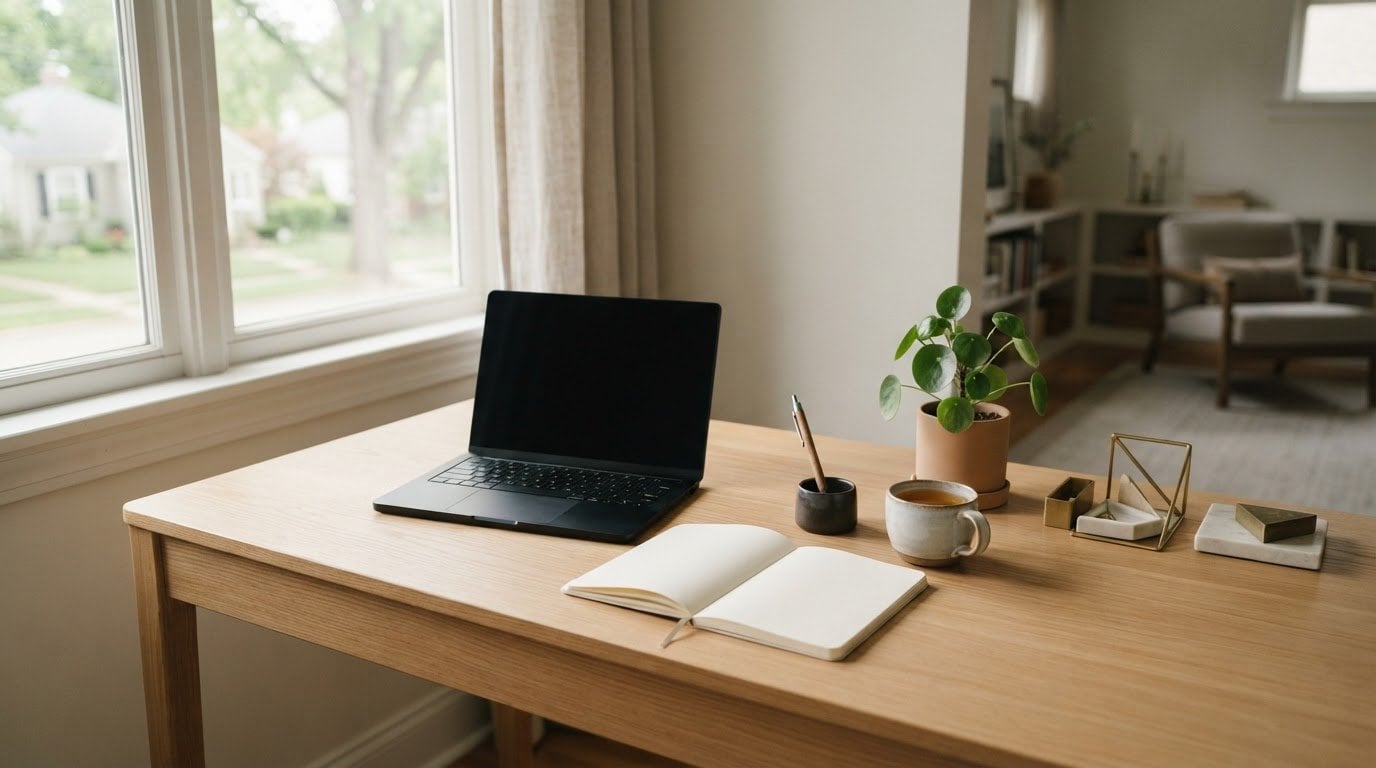

The most useful desk timer may be the one that asks for the least attention. An aesthetic desk timer should make time visible without making your workspace feel busier. Choosing one involves a practical trade-off: a digital display may draw you back to a screen, while a purely utilitarian design may feel out of place among carefully chosen desk accessories.
Consider more than appearance. A timer needs to be easy to read from where you work and simple to use for the tasks you actually do. The right format offers a clear time cue without adding another screen to check.
This guide compares digital and physical timer styles, then covers practical details such as visibility, interaction, and how an object fits your desk. You’ll learn how to weigh those factors for your workflow, including whether a light-based visual timer is a good fit. Timeqube uses color-coded light signals to show time passing without digital timer software.
Key Takeaways
- Choose an aesthetic desk timer that fits your workspace while keeping time easy to see.
- Compare digital, analog, and physical visual timers by how you interact with them and where you plan to use them.
- Match the timer’s visibility and format to your routine, whether you’re studying, working independently, or hosting meetings.
- Decide whether on-screen customization or a physical time cue better suits your focus preferences.
- Explore how Timeqube’s color-coded light signals offer a screen-free way to communicate time in professional meetings and therapy sessions.
Why choose an aesthetic desk timer instead of another screen?
An aesthetic desk timer does two jobs: it helps you keep track of time, and it feels at home in your workspace. Instead of opening a phone or computer whenever you want to check a session, you can keep a separate time cue within your natural field of view. The aim isn’t to make every desk look the same. It’s to make time easier to notice in a way that suits your surroundings and routine.
A visible cue can support a structured work rhythm. For example, the Pomodoro Technique uses a timer to divide work into focused intervals and breaks. But a timer only helps if you use it. Its appearance matters because an object that feels out of place may be less welcome on your desk. At the same time, an attractive design isn’t enough if the timer is hard to read or awkward to use.
This short video looks at a theme-led physical timer and discusses its design alongside its use:
What makes a desk timer both useful and visually at home?
Start with the visual style already present on your desk. A timer might complement a warm, tactile setup, fit among crisp modern accessories, or provide a deliberate contrast. There’s no universal ideal. Then check whether you can read it from your usual working position without leaning forward or interrupting a task. A quiet-looking design may feel calming to one person, while another may prefer a brighter display that’s easier to notice.
Keep the task in view, too. Will the timer mark a work period, a break, or a meeting segment? If it doesn’t support a real habit, it risks becoming another object to work around. Simplicity and low visual clutter can be useful preferences, but they aren’t rules for every workspace.
When does a physical timer suit a desk better than a digital one?
A physical timer provides a separate, visible cue. A digital timer is accessed through a screen. That distinction matters if checking a timer on your phone or computer also brings other tabs, messages, or notifications into view. Timeqube is a physical visual timer that communicates time through color-coded light signals without digital timer software. It’s designed for desk use in professional settings, including meetings and mind/body therapy sessions.
A digital timer may suit you better if you value on-screen customization, dashboards, or keeping tools together on your computer. Neither format is automatically better for focus. Match the choice to your habits: if you already work comfortably in a digital workspace, a screen-based timer may feel natural. If you want time in view without opening another screen, a physical cue may be a better fit.
Which features matter when comparing an aesthetic desk timer?
Look beyond appearance when comparing timers. Consider four things together: the format, how quickly you can read it, how you interact with it, and the work it needs to support. This helps separate features that suit your routine from details that are simply decorative. Use the comparison below to see how the main formats differ.
| Format | Time visibility | Interaction | Work context to consider |
|---|---|---|---|
| Digital timer | Shown on a screen; layout varies by tool | Screen-based, with customization available in some tools | Useful if you prefer a digital workspace or configurable display |
| Analog desk timer | Read from its physical display | Handled directly, without a timer dashboard | Consider whether its display is legible from your usual position |
| Physical visual timer | A visible cue communicates time passing | Viewed directly rather than through software | May suit desks, therapy sessions, or meetings where shared visibility matters |
| Timeqube | Color-coded light signals communicate time | Physical timer hardware, not digital timer software | Designed for mind/body therapy sessions and professional meetings |
Digital, analog, and visual timers: what changes?
Digital timers use screens, and some offer interface customization or dashboard features. Analog timers are physical objects that you interact with directly rather than through a digital dashboard. A visual timer is defined by how it conveys time: a visible cue helps you perceive elapsed or remaining time, depending on the design. These categories can overlap, so compare the display and interaction rather than relying on the label alone.
Sound is another point of comparison. Some timers use an audible signal to mark an endpoint; others make time visible, and digital tools may use screen-based alerts. Sound can be useful in a shared room or easy to miss in a noisy one. A visual cue may be easier to notice quietly, but its usefulness depends on placement, lighting, and the task. Choose the approach that suits the setting.
How to assess style, visibility, and interaction
Check the display from where you normally sit or stand. Can you understand the time cue at a glance, or do you need to pause and interpret it? Consider the room as well: a quiet therapy space, a busy office, and a study desk can call for different levels of visual presence or sound. Ergonomics also concerns how tools fit the person and task; the Applied Ergonomics Society is part of the Institute of Industrial and Systems Engineers.
Practical distinction: A digital timer presents time through a screen; a visual timer makes time perceptible through a cue. For a physical option designed for professional meetings, explore the Timeqube meeting timer. Apply the same criteria to any timer: weigh visibility, interaction, and work context together, then decide which combination suits your space.
Aesthetic desk timer options compared by workspace and work style
The right timer depends on how you work and who shares your space. A customizable screen may suit solo study, while a separate physical cue can be easier to glance at during a meeting. An analog timer offers another hands-on option. Compare each format with your actual routine instead of ranking them in the abstract. A considered approach to desk accessories means choosing objects for both their function and how they fit your workspace.
| Timer option | Visibility | Screen dependence | Workspace fit | Possible drawback |
|---|---|---|---|---|
| Digital theme-led timer | Displayed on a device screen | Requires screen access | Useful for solo work when customizable sessions or a digital workspace feel natural | May bring other on-screen activity into view |
| Analog desk timer | Read directly from its physical display | No timer dashboard needed | Can suit a desk where a hands-on object feels at home | Readability depends on its display and placement |
| Physical visual timer | Uses a visible cue to communicate time | Separate from a digital screen | Can suit focused work or shared settings where time should remain visible | A visual cue may not suit every room or personal preference |
For focused solo work or study
A screen-based Pomodoro timer can suit someone who likes to adjust session settings or keep timing alongside digital study tools. Its interface may fit naturally into a screen-centered routine. The trade-off is that checking the time still means looking at a device. A physical timer can keep time visible away from that screen, which some people prefer during reading or writing. Neither format is a universal focus solution.
For professional desks and shared workspaces
In a shared room, consider whether other people can see the cue without it dominating the space. An audible signal may mark an endpoint, but it can interrupt a quiet task or conversation. A visible physical cue offers a quieter way to communicate time. Timeqube uses color-coded light signals and is designed for professional meetings and mind/body therapy sessions.
Lighting matters, too. A cue that blends into bright surroundings may be harder to notice, while a highly prominent display could draw more attention than you want. Consider the ambient light and the room’s purpose when choosing where to place a timer. In a shared workspace, aim for a position where the people who need the cue can see it, without making it intrusive to everyone else.
Use the comparison as a starting point, not a verdict. A screen-based tool offers an interface; an analog timer offers direct physical interaction; a visual timer makes time perceptible through a cue. The best fit depends on whether you work alone or with others, how often you need to check time, and what kind of presence feels right on your desk.
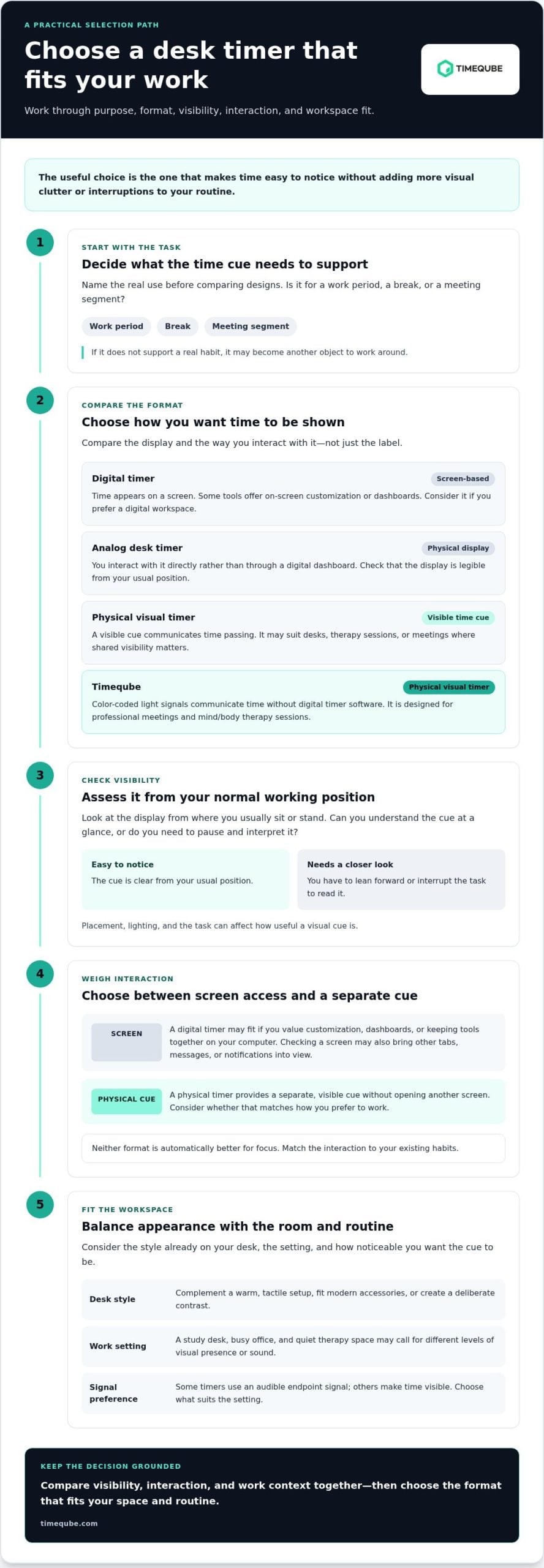
How to choose a desk timer that fits your space and routine
Start with how you’ll use the timer, not with a feature list. An aesthetic desk timer should meet a practical need and feel comfortable in its setting. Use these steps to narrow your options before you buy.
- Start with the workspace and task. Decide whether the timer is mainly for solo study, focused desk work, therapy sessions, or professional meetings. A timer used only by you can be placed for your own view. In a shared room, consider whether colleagues or clients also need to see the time cue.
- Set your visibility preference. Think about where you sit, how far away the timer will be, and whether a quick glance should tell you what you need. Picture it in its intended spot. If you’d have to lean forward or stop working to read it, that format may not suit your routine.
- Choose the interaction style. Would you rather use a digital interface with customization, or keep time visible through a physical cue? Consider how often you want to look at a screen to start or check a timer. Pick the interaction that fits your existing habits, rather than assuming one format suits everyone.
- Separate function from appearance. First identify what the timer must do, such as mark a work period or make time visible to meeting participants. Then consider how its form fits your desk. A design can complement your setup, but appearance alone doesn’t show whether it will be easy to use.
- Test it against a real routine. Picture a typical work period or meeting. Check whether you can read the display from your normal position and whether the interaction feels simple enough to repeat. In a shared workspace, consider how the cue works for others in the room as well.
Match the timer to the desk and task
Keep practical requirements distinct from style preferences. A study timer may need to be easy for one person to check, while a meeting timer may need to communicate time to participants. During a session, a visible cue can support time awareness without asking everyone to monitor a screen. Once the task and viewing needs are clear, decide whether the timer’s visual presence feels at home on the desk.
Avoid buying features you will not use
More modes or dashboard features aren’t automatically more useful. Before choosing, make a short checklist: task, viewing distance, who needs to see the cue, preferred interaction, and whether sound suits the room. If meetings are your primary use, consider a physical timer designed to communicate time through color-coded light signals.
Let the checklist guide your choice. First select an option that meets your functional needs, then decide whether its appearance suits the space. This keeps the decision grounded in your routine rather than in features or styling you may not use.
Timeqube as a physical visual timer for a considered desk
A considered desk doesn’t need another screen to make time visible. Timeqube is physical visual timer hardware designed for mind/body therapy sessions and professional meetings. It gives people who prefer a direct, visible cue an alternative to a timer accessed through digital software. Whether it suits your desk depends on your task, viewing position, and preference for a physical cue.
A visual timer without another software dashboard
Timeqube uses color-coded light signals to communicate time. The passage of time is visible without relying on a digital timer dashboard. The signals provide a visual reference for the person using the timer and, where appropriate, others in the room. The key distinction is simple: Timeqube communicates time through light rather than a screen-based countdown.
This format suits people who want to keep a timer in view without opening a phone or computer. It can also provide a shared visual reference during a conversation or session. A screen-based timer may be a better fit for people who prefer digital customization or want timing integrated into their existing on-screen workflow. The choice is about which interaction feels natural in the setting, not about one format being right for everyone.
Desk use, professional settings, and customization
At a professional desk, a visible cue can make time present during work or meetings without asking participants to check a screen. In a meeting room, place the cue where the people who need it can see it while keeping it appropriate to the room. In a mind/body session, a physical timer can serve as a visible time reference. Consider whether that kind of cue supports the way you work with clients or colleagues.
Businesses that want a branded workspace object can choose Timequbes customized with a corporate logo. This connects the timer with the visual identity of an office or professional setting while retaining its practical role as a timekeeping tool. Logo customization is especially relevant when the object will be seen by colleagues or meeting participants. For individual use, focus first on the timer’s role and how it fits your desk.
An aesthetic desk timer earns its place when appearance and function work together. Timeqube is an option if you want physical visual timer hardware for professional meetings or mind/body therapy sessions, with time communicated through color-coded light signals instead of digital software. Choose the format that feels right for your workspace and routine.
If a physical time cue fits your setting, explore the Timeqube visual timer and consider how it could work on your desk or in your sessions.
Make time a thoughtful part of your workspace
The right aesthetic desk timer is one you’ll use because it fits the way you work, not simply because it looks good in a photograph. Before choosing, picture where it will sit and how you’ll use its time cue during an ordinary workday. A small, intentional change can make your workspace feel more considered without asking you to redesign it.
For professional settings, Timeqube brings timekeeping into view with color-coded light signals. Businesses can also choose Timequbes with corporate logos when a workspace object should reflect their brand. It’s designed for desks and meeting spaces where a visible time cue has a practical role.
Explore Timeqube’s visual timer and consider whether a physical cue belongs in your workspace. See how Timeqube could fit your desk or sessions, then choose the approach that feels natural for your routine.
Frequently Asked Questions
Is an aesthetic desk timer useful for more than decoration?
Yes. A timer can support a repeatable work habit, such as setting aside a defined period to draft, review notes, or take a short pause between tasks. Its appearance may make it feel like a natural part of your workspace, but usefulness comes from how it fits your routine. Before choosing an aesthetic desk timer, identify when a visible time cue would help during your day.
Can a physical visual timer help me avoid checking my phone?
It gives you a way to check time without picking up your phone. For example, if you’re writing and want to know how much of a work period remains, a physical timer within view offers a separate reference point. That can help you avoid opening unrelated apps during a time check. It won’t prevent every distraction, so consider whether keeping your phone out of reach also suits your routine.
What should I look for when choosing a desk timer?
Start with the task you want it to support, then consider whether you can read and operate it comfortably from your usual position. Think about how often you’ll adjust it, whether you prefer a screen or a physical control, and whether an audible signal suits the room. Picture using it during a typical task, not just viewing it on an uncluttered product page.
What is the difference between a digital timer and a visual timer?
“Digital” describes how a timer is presented or operated through a screen. “Visual” describes how time is communicated through something you can see. These terms aren’t always opposites: a digital timer can use visual information, while a physical visual timer presents a cue outside a screen. When comparing options, focus on the experience you want: screen-based controls, a visible physical cue, or both.
Can a visual timer work in a shared office or meeting room?
Yes, if it’s positioned where the people who need the cue can see it. In a meeting, placing a timer in a shared sightline can make time easier to notice without requiring each person to check a device. Consider the room’s lighting and seating, too. A cue hidden behind a laptop or visible to only one participant may not serve the whole group as intended.
Does a Timeqube require timer software?
No. Timeqube is physical timer hardware, not digital timer software. It communicates time through color-coded light signals, so you don’t need to open a timer dashboard on a phone or computer. This suits people who prefer a dedicated object for timing sessions or meetings. Timeqube is hardware, rather than an app or software service.
Can a Timeqube be customized with a company logo?
Yes. Timequbes with corporate logos are offered for businesses that want a branded workspace object. A logo can connect the timer to an office, meeting room, or professional setting. Consider how visible the item will be and whether branded desk accessories fit your workplace identity. Its practical purpose remains central: it provides a physical way to communicate time.